Why rebrand, just ship already 🚢
Our original brand was designed a few years ago by our CEO Adam, and then, Freetrade was little more than an idea in his head. Naturally, growing as a business and getting closer to launching our product, made it clear that we needed a brand that reflected our vision for Freetrade.
The old brand got us to where we are. We have successfully crowdfunded in two heavily over-subscribed rounds. We’ve won the Innovator of the year award (although the logo didn’t have much to do with this, just thought I’d mention it 🏆).

But it wasn’t going to have the identity, digital presence and scalability to set us apart.
Studio Koto
When I joined Freetrade last year it was all systems go to find an agency to work with that could deliver our vision, so we had set out to find someone that understood what we were trying to achieve. The company that stood out to us for their enthusiastic and engaging pitch was Studio Koto. They have also worked with companies like Airbnb, Fanta and Gumtree, and the one that got me personally was Farewill, making writing a will exciting is a feat in itself!

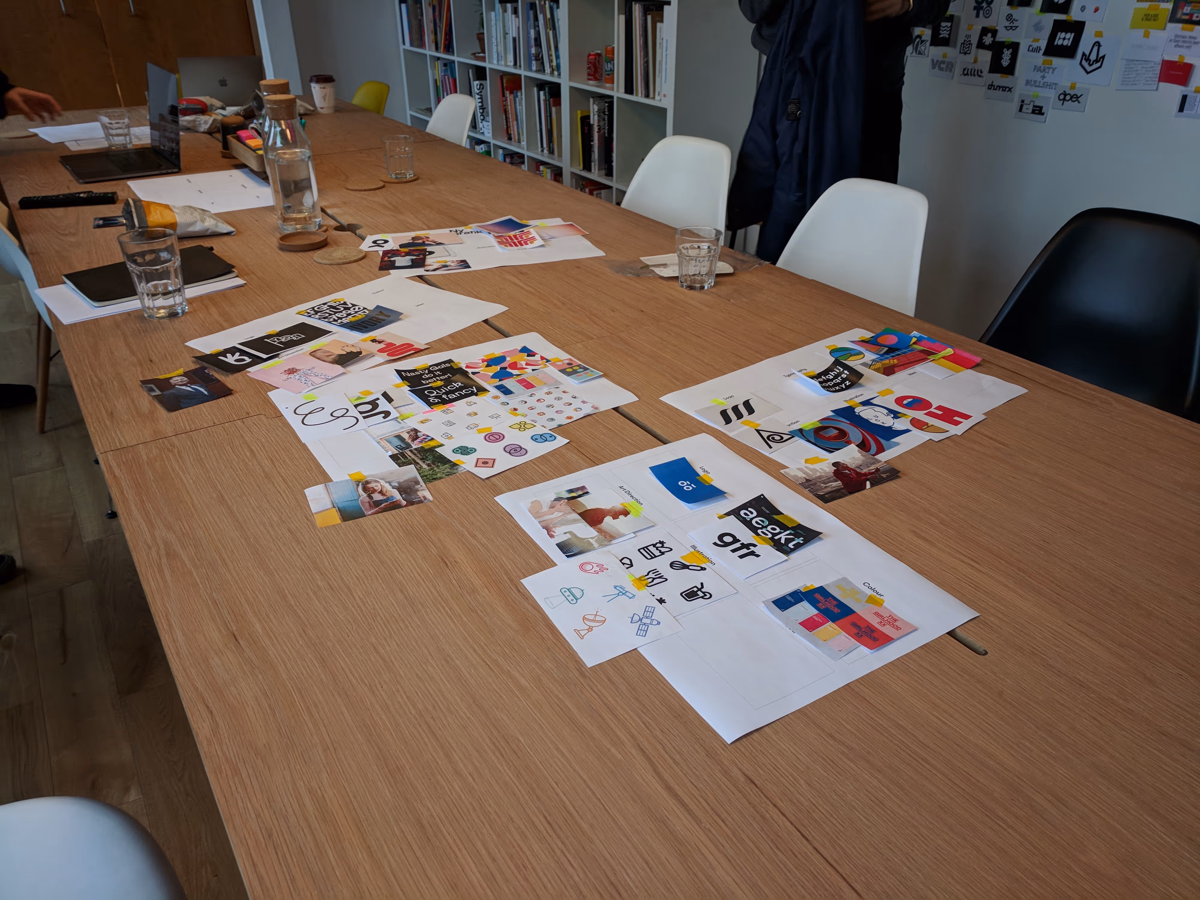
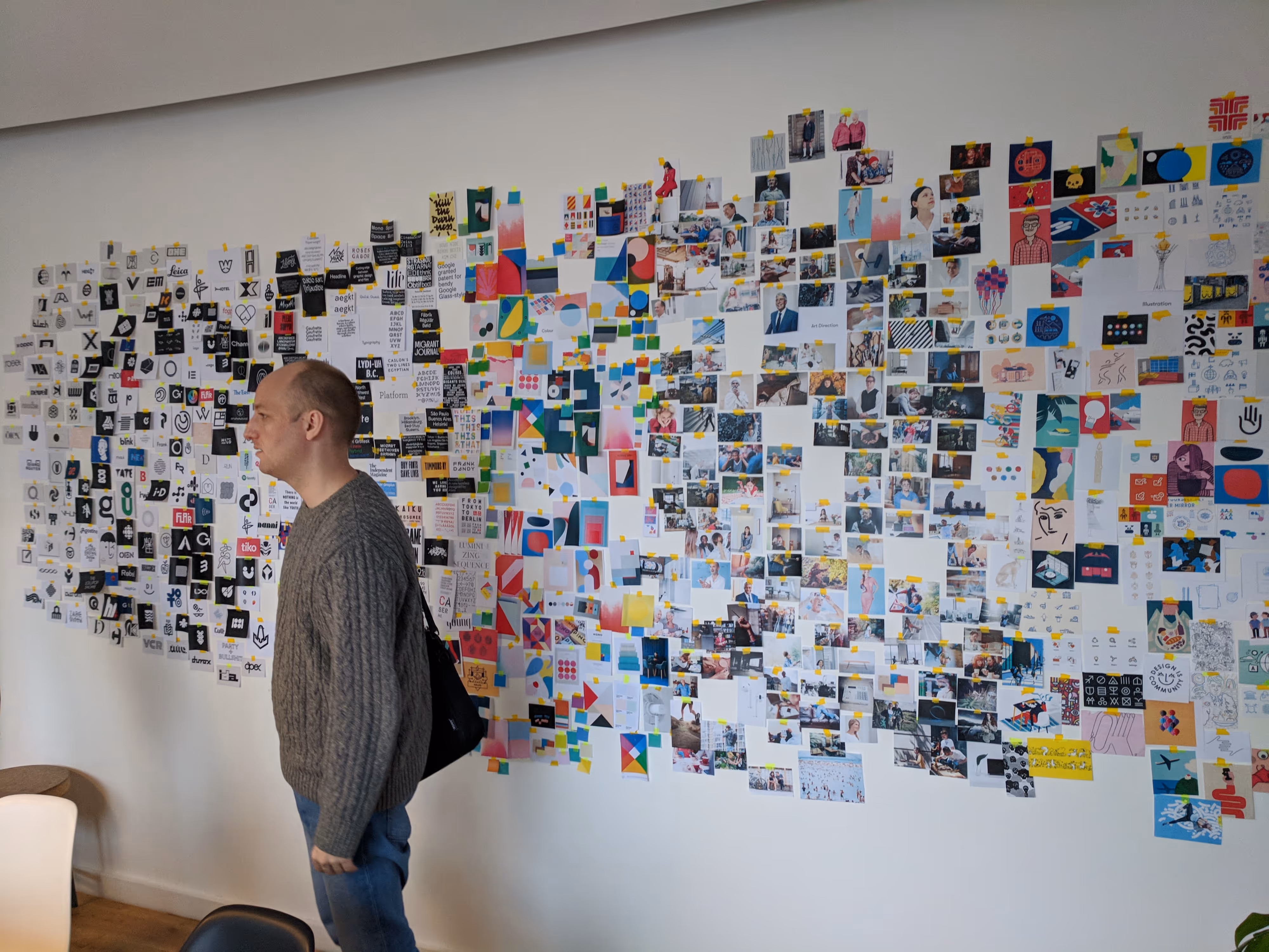
We started our branding engagement with interviews and immersion. They put us in control by teasing out what we thought best represented Freetrade both in the more traditional sense, i.e. logos, palettes and typography, but also in more abstract ways– “what fictional character do you think best represents Freetrade?”. We felt instantly that the guys were in sync with us and what we wanted which made the process much more comfortable.
“We’re in the City of London with a hoodie on”
I think it was one of the best quotes the Freetrade team gave in these sessions. 🎙 ️We felt it played to our disruptive nature and being an edgy company in an old-school and traditional sector.
We explored a variety of routes for our new logo– some that used a digital revolution as it’s primary inspiration, to more character driven route. What the process highlighted was where we saw the company sitting on a scale of fun and playful to “digital outlaw”. Some of the examples that came out were brilliant, and we said we’re less Tyler Durden, more the Dude. Less Neo, more Ferris Bueller. I indeed at no point said that we’re like Harry Potter, don’t listen to anyone who’ll tell you otherwise. 👀

Introducing our new brand
Our logo
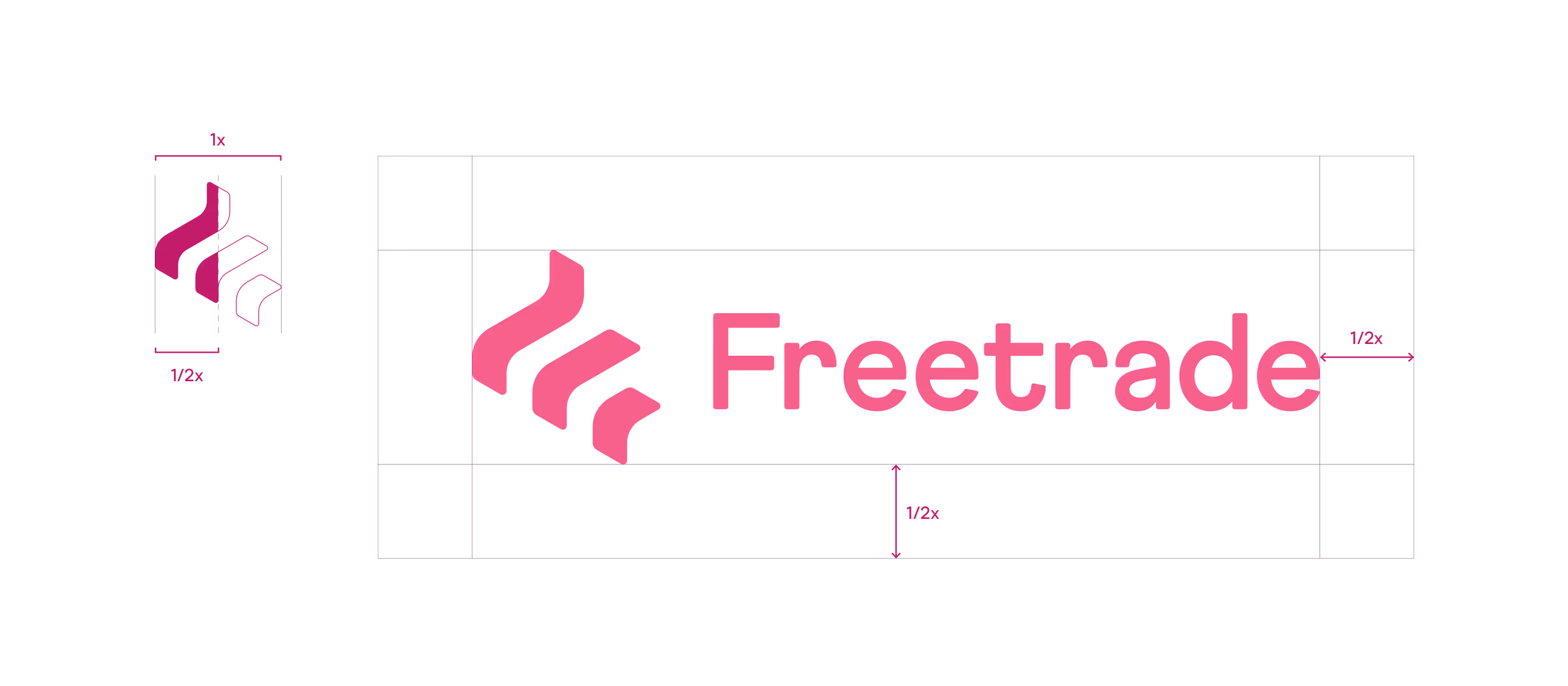
We wanted to create a bold and assured identity that was instantly recognisable, but that was also more accessible than most financial services. Using softer curves, a tweaked and characterful type and of course pink as our primary brand colour, I feel we achieved this goal.
Our symbol was born between the idea of the shape of an “F” and a rising portfolio graph. It’s also been described as a flag or flame declaring intentions. 🔥

Freedom comes in one colour: Pink

Our core colour is pink. Freedom pink.
That’s what we’re calling our new brand colour, and we love it.
We are more than just one colour though; we have a rich palette that we use in complementary and contrasting ways. We can use the softer end of our palette with light pink, purple, beige and apricot (my personal favourite after our pink) or for a punchier and stronger emphasis we can use our pink, raspberry, plum or indigo.
These colours have been chosen together to have a more balanced, gender-neutral feel rather than the masculine dominance of the blue, red, green and grey that are scattered throughout fintech.

Typography

Our primary brand font is called Modern Era. It’s from OMSETYPE an independent type foundry based in London. We love it for its strong geometric shapes and friendly character making it equally suited for body copy and display type.
We used another similar font from the same foundry for our Freetrade word marque, called Athletics. We modified it by opening up the arm of ‘e’ for legibility, especially at small sizes. We also added a radius to letterforms to create balance with symbol and redrew the ‘r’ for an improved relationship with the ‘a’.

Directional evolution
We also did a lot of work around how we’ll continue to progress and evolve the brand over the coming months so that we have room to grow from where we are now to a place where when we have a more mature product our brand still works for us.

Preparing for launch 🚀
If you’ve read this far, you deserve a little glimmer of hope. We have submitted the first version of our iOS app to the App Store and we’re awaiting approval. 🤞
When we have that, we’ll be starting to on-board our first members. If you’re sitting at number 28,000 in the queue or you haven’t requested an invite yet don’t panic, now is the time to do something about it!
Head to freetrade.io and enter your email address to get on the waitlist and share your link with your friends (it’s better than another Candy Crush invite, right?). For everyone that signs up, we’ll bump you up the queue.
Want to come and help shape the future of Freetrade? We’re hiring across a number of positions. Check out our careers page.
Thanks to Adam Dodds, Viktor Nebehaj(🔥), Jowey Roden, Dave Raxworthy and Courtney Gordon.


.avif)