As you may have noticed, Freetrade has a fresh new look and feel.
Implemented in late 2024 across our website and web platform, the refreshed brand identity is now being rolled out on the Android version of the Freetrade mobile app as well. iOS customers can look forward to seeing it on their apps within the next month.
Read on to learn how we navigated through our brand’s history and created something unique that honours our past and looks towards a promising future.
Our brand evolution: from sunset to bold pink
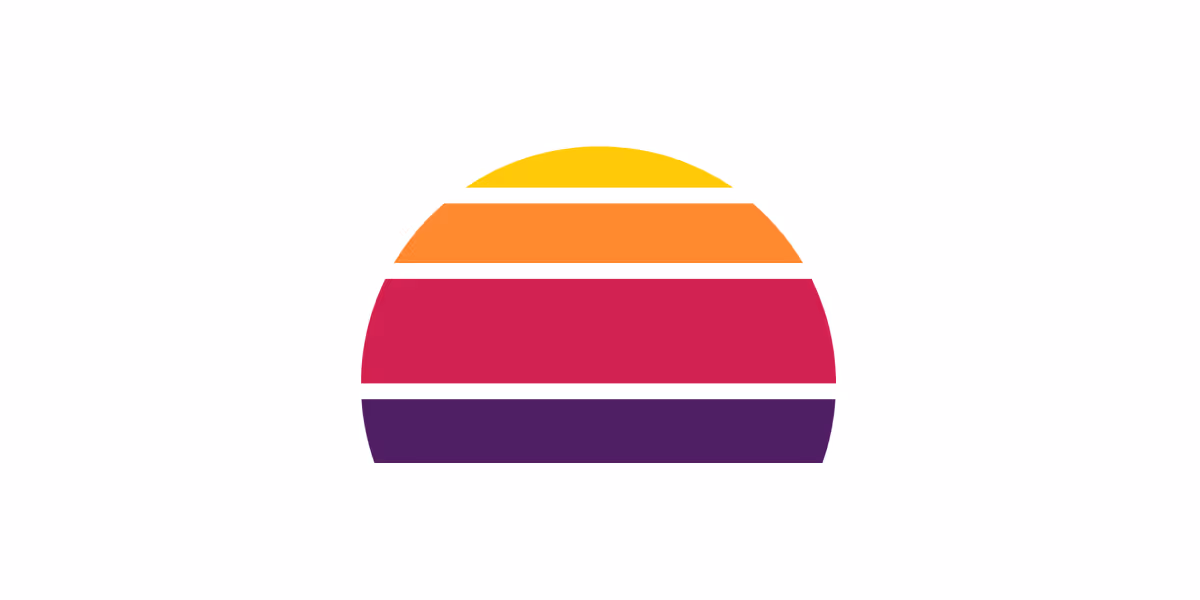
Freetrade’s journey started with a sunset as our very first logo. Although our company has evolved, the mindset of helping our customers with their investment journey has always been at the core of Freetrade.
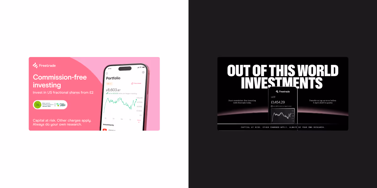
In 2018, we worked with Koto, a branding and digital design studio, to evolve our brand even further with a distinctive bold pink colour rarely seen in the fintech industry and an approachable tone of voice. This look will be familiar to many of our customers. Thank you for being with us on this journey!

Why we rebranded Freetrade
Freetrade has grown significantly as a company. Trusted by UK retail investors for our competitive product offering and easy-to-use mobile app. Building on this foundation, we launched a web platform last year, addressing one of our most common feature requests and providing a holistic investment experience to Freetrade customers.
Our brand assets had served us well to this point, but we wanted to hit a more mature tone for our brand positioning.
Given the success of our initial engagement with Koto back in 2018, we decided to collaborate with them again for round two!
As part of our repositioning strategy, we wanted to retain our pink heritage and resurrect the optimistic route that our first logo captured so well.
Enter our new branding.

Our rebrand process with Koto
With the help of Koto’s team, we reflected on the words and visuals that best resonated with the Freetrade of today.
We chose aspirational, optimistic, modern, focused, disruptive, and trusted as the keywords that best represent the Freetrade brand.

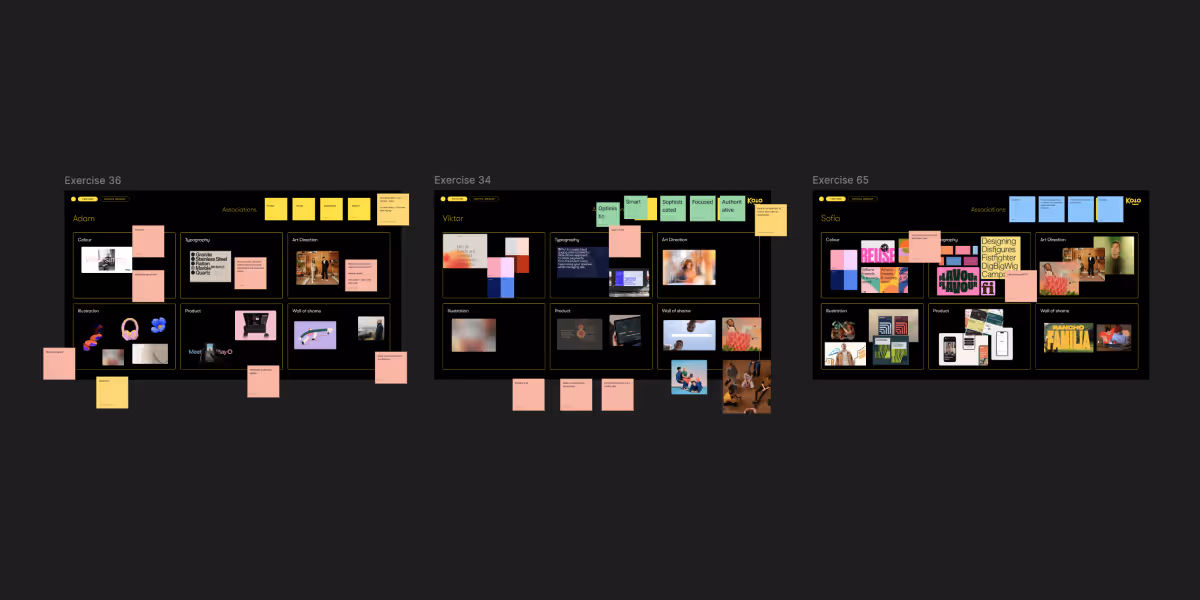
For the design-curious, here’s a sneak peek of other visual ideas we explored:
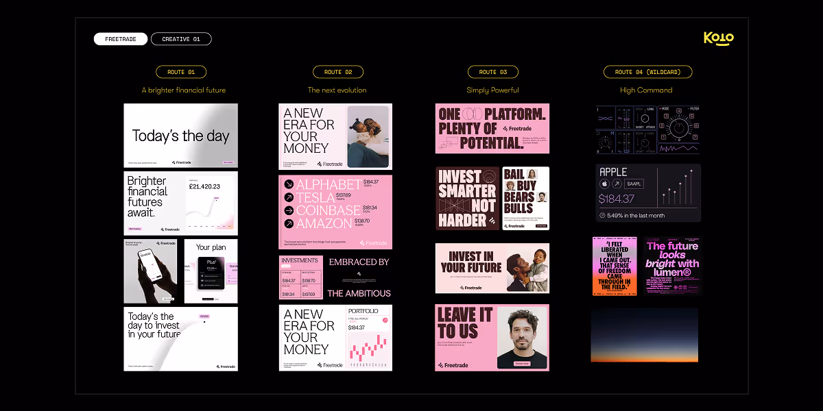
We wanted a visual style that reflects the investment platform’s simplicity and ease-of-use, as well as the optimism crucial to a do-it-yourself investment strategy, where your investments can go down as well as up.
This involved a comprehensive review of our brand language, including updates to our colour palette, brand assets, and logo, as well as the introduction of a whole new set of illustrations.
Introducing our new visual concept
Let’s connect the dots.
You may be wondering how shifting to a darker colour scheme fits within everything we’ve covered.
Our concept centres on the infinite sky, inspired by a minimalistic aesthetic and the naturally stunning colours of sunrises and sunset. This aligns with our new brand keywords: aspirational, optimistic, modern, focused, disruptive, and trusted.
We opted to lean more towards black than white to align with the concept, maintaining a variation of our pink as an accent colour.
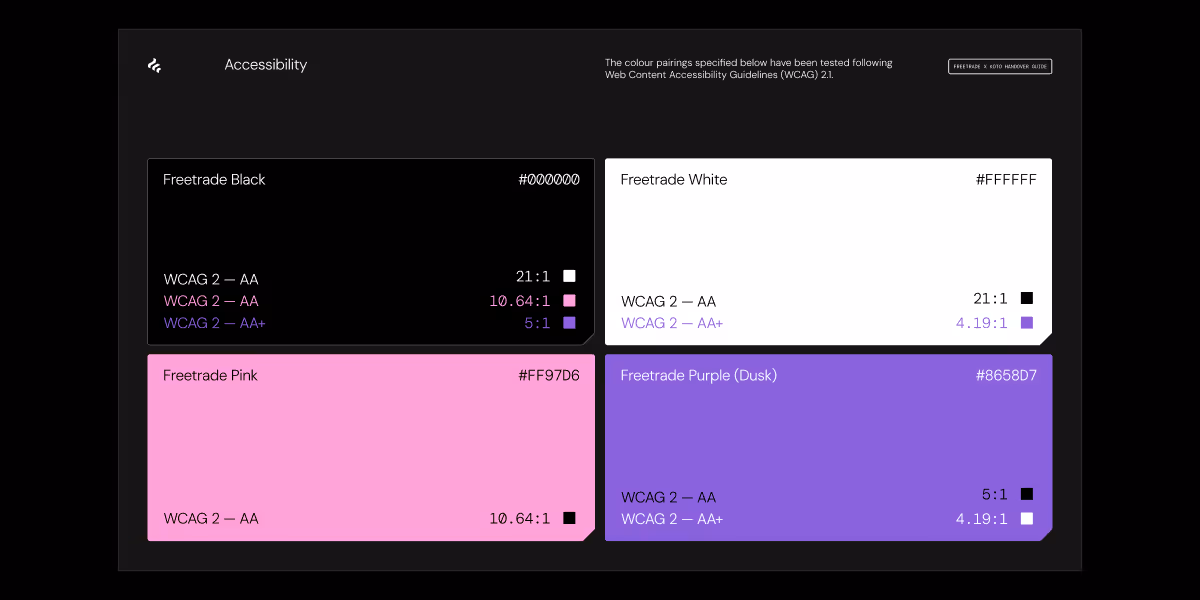
This change may seem abrupt, but for us, it made complete sense. Not only did we want our optimistic concept to relate to the sky’s natural effects, where pink is often a result of colour combinations, but we also aimed to address accessibility issues associated with using our former pink.
Our new brand identity
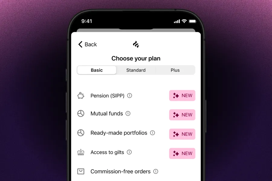
Our new logo has minimal changes, but it is now more compact.

Our new main colours use a mix of pink and purple to ensure compliance with the Web Content Accessibility Guidelines (WCAG) AA conformance level.
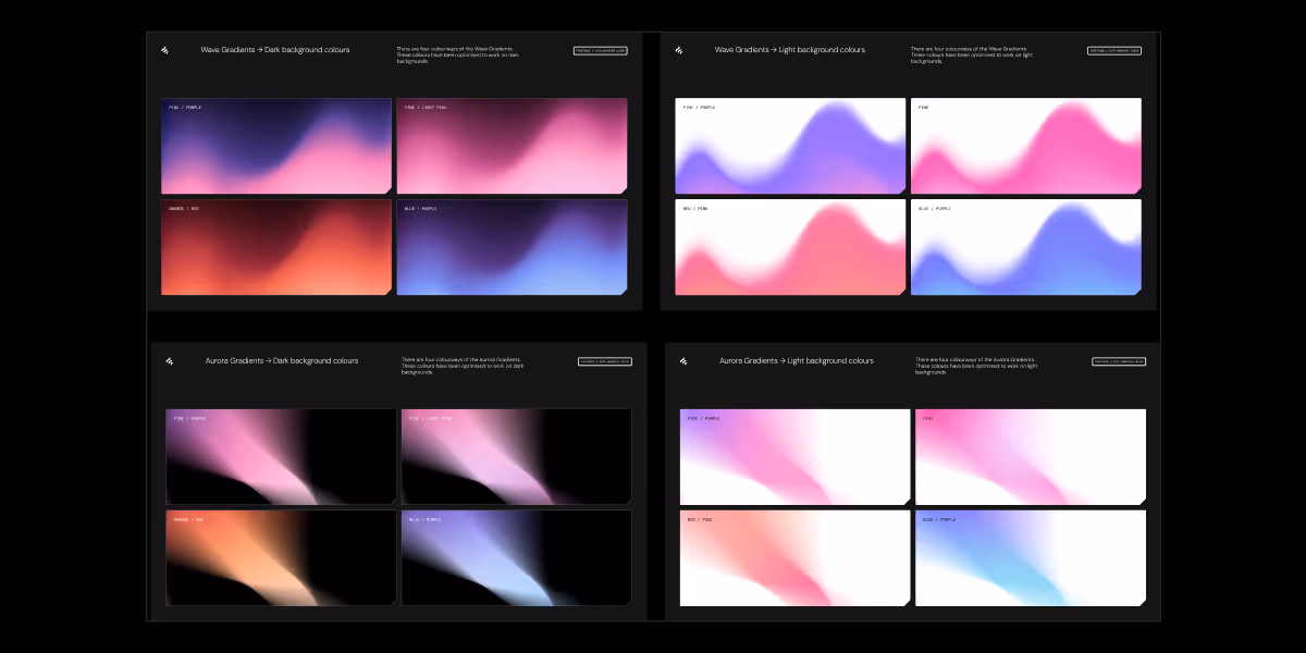
We’ve introduced a new set of gradients designed for both light and dark modes. While we’ll mainly lead with dark, you can still experience our web platform and mobile app in whichever mode suits you best.
The new colours, typography, and illustrations all come together to express our new concept.
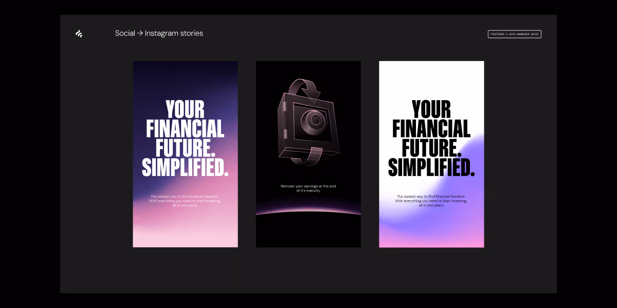
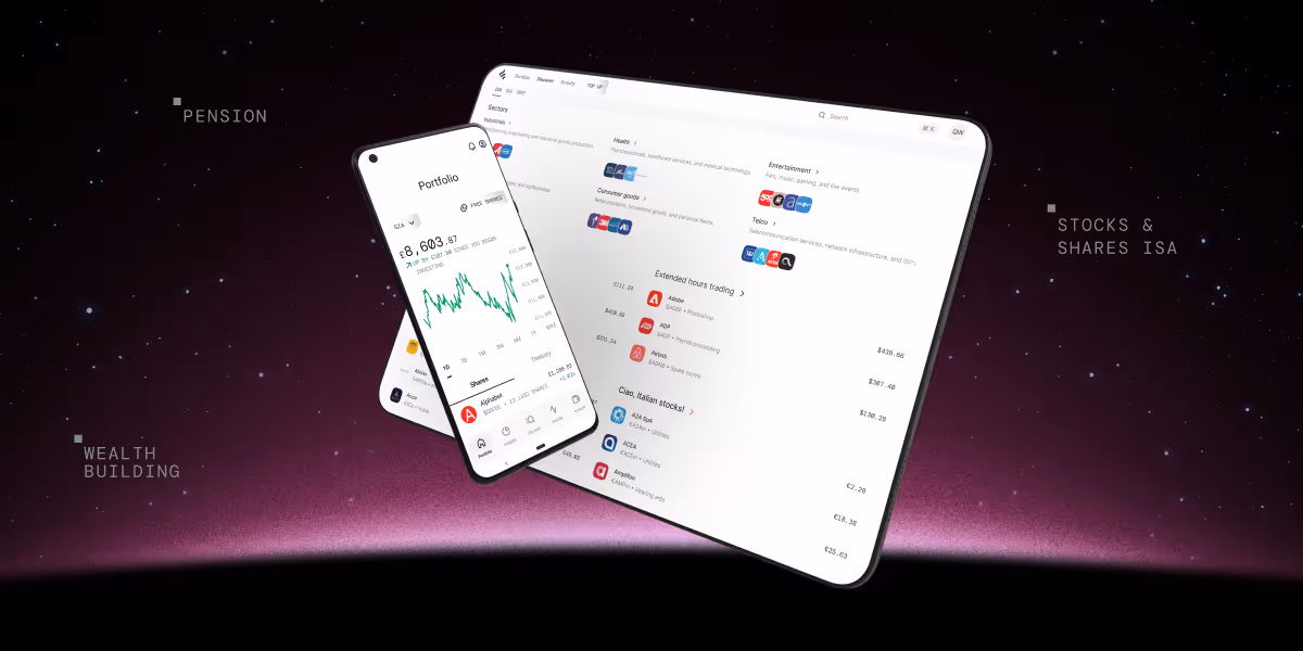
Where you’ll see Freetrade’s new look
The refreshed brand identity can now be seen across our website, social media, web platform, and as of this week: the Android mobile app. iOS customers: you’re next! Watch this space.
On top of this, we’ve also launched a new design system, but that’s a story for another day.
Thank you to everyone at Koto and Freetrade for the part you played in this next step of our journey. A major congratulations to our spectacular design team, who worked so hard to bring this vision to life.
If you want to join the team and help shape the future of investing, check out our Careers page.
This should not be read as personal investment advice and individual investors should make their own decisions or seek independent advice. This article has not been prepared in accordance with legal requirements designed to promote the independence of investment research and is considered a marketing communication.When you invest, your capital is at risk. The value of your portfolio can go down as well as up and you may get back less than you invest. Past performance is not a reliable indicator of future results.Freetrade is a trading name of Freetrade Limited, which is a member firm of the London Stock Exchange and is authorised and regulated by the Financial Conduct Authority. Registered in England and Wales (no. 09797821).